Selected Work

Work that had to
survive real use.

Brand systems, packaging, digital experiences, multilingual copy, physical production, presentations, and selected light engineering, shown with the operating context behind the finished work.

A note on the portfolio

Fewer thumbnails. More evidence of how the work actually behaves.

We would rather show a smaller number of projects with enough context to understand the decisions, systems, production, and implementation behind them than build a wall of attractive images with no explanation.

Some of the work shown here comes from long running organizations closely connected to the team behind Bainbridge. We label that relationship clearly rather than presenting every project as a conventional outside client engagement.

The result is deliberately selective: fewer examples, clearer relationship context, and more attention to how the work functioned after the presentation ended.

What the work can cross

The useful part is often what happens between disciplines.

A brand project becomes packaging. Packaging becomes a launch. The launch needs a landing page. The sales team needs a deck. The internal team needs templates. Sometimes a small digital build needs to be implemented, not merely handed off.

01

Brand

Identity systems, naming, messaging, multilingual copy, guidelines, and the rules that make the brand usable by other people.

02

Campaign

Concepts, key art, copy, channel adaptation, toolkits, and the production work required after the first asset is approved.

03

Digital

Websites, landing pages, interfaces, responsive systems, prototypes, and selected light engineering for appropriately scoped builds.

04

Physical

Packaging, mechanicals, prototyping, retail graphics, vendor handoff, and production aware design that has to survive materials and manufacturing.

05

Presentations

Investor, sales, board, and pitch materials with narrative restructuring, data visualization, multilingual copy, and editable systems.

06

Systems

Reusable components, templates, documentation, governance, and production structures that reduce repeated design decisions over time.

01

OXOMIO

Consumer brand · Wellness · Retail

Relationship
Long term brand platform and operating experience from the team behind Bainbridge.
Period
2020 to present
Disciplines
Brand Systems · Packaging & Production · Digital Experiences · Retail · Copy & Localization

A brand designed not as a launch package, but as an operating system: identity, packaging, digital, retail, multilingual communication, and production working together across a growing consumer business.

The challenge

The work had to stay coherent while expanding across a large product range, multiple physical and digital touchpoints, recurring launches, different production vendors, and ongoing internal use. The system needed enough structure to scale without making every new SKU or campaign feel mechanically identical.

Our response

The team built and maintained the brand across the surfaces where consistency becomes difficult: product architecture, packaging families, campaign assets, commerce, retail environments, templates, production files, and multilingual market communication. The value was not one hero redesign; it was continuity across years of real use.

What the work had to do
01

A multi product packaging language designed to stay recognizable while supporting different formulas, formats, and product tiers.

02

Production ready packaging thinking carried beyond the label into cartons, presentation boxes, certificates, inserts, variants, and vendor handoff.

03

A physical retail environment translating the same material and brand language into shelving, lighting, furniture, merchandising, and customer space.

04

Multilingual copy, adaptation, digital work, and recurring brand production managed as parts of the same operating system.
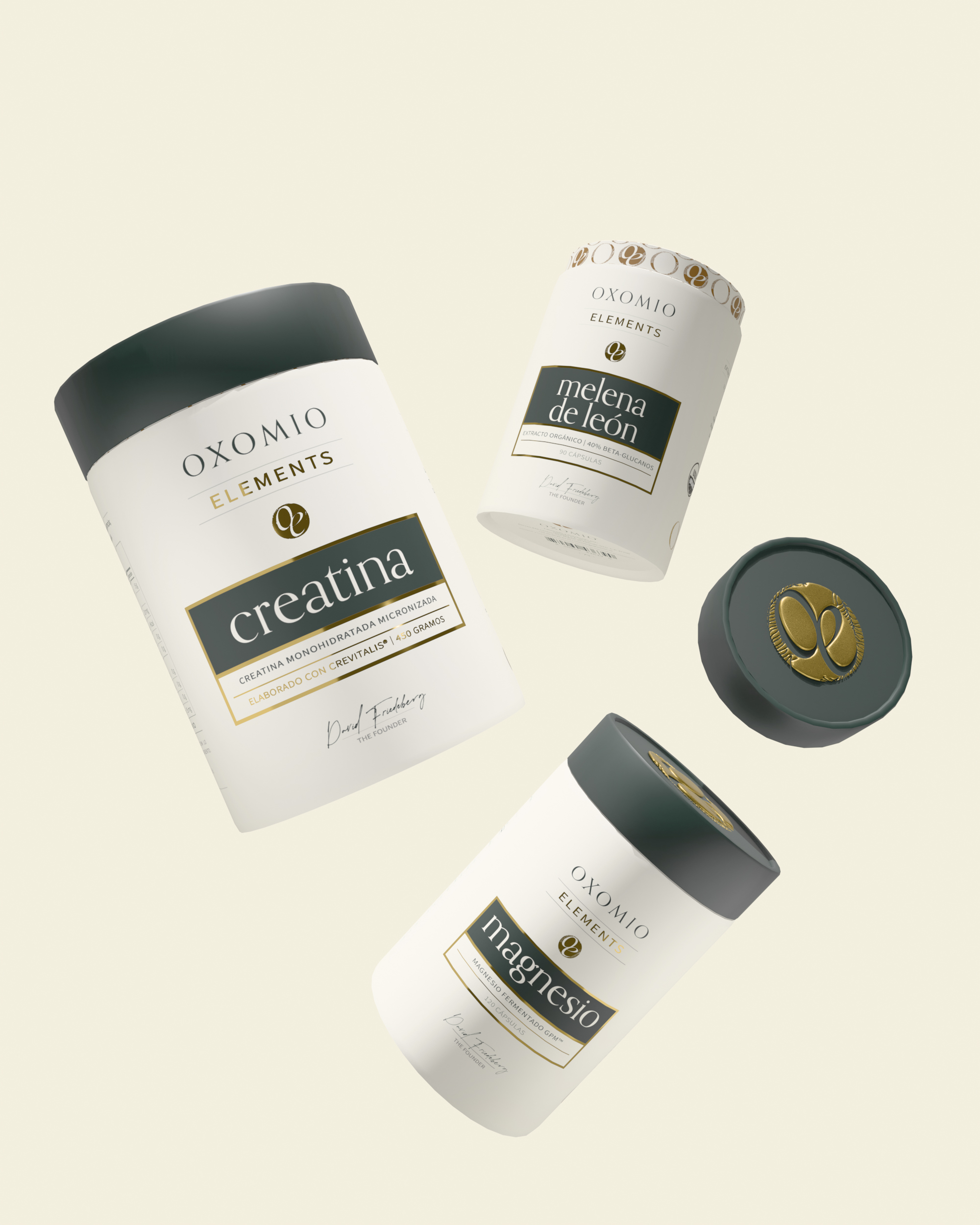
OXOMIO Elements packaging system with Creatina, Magnesio, and Melena de León products
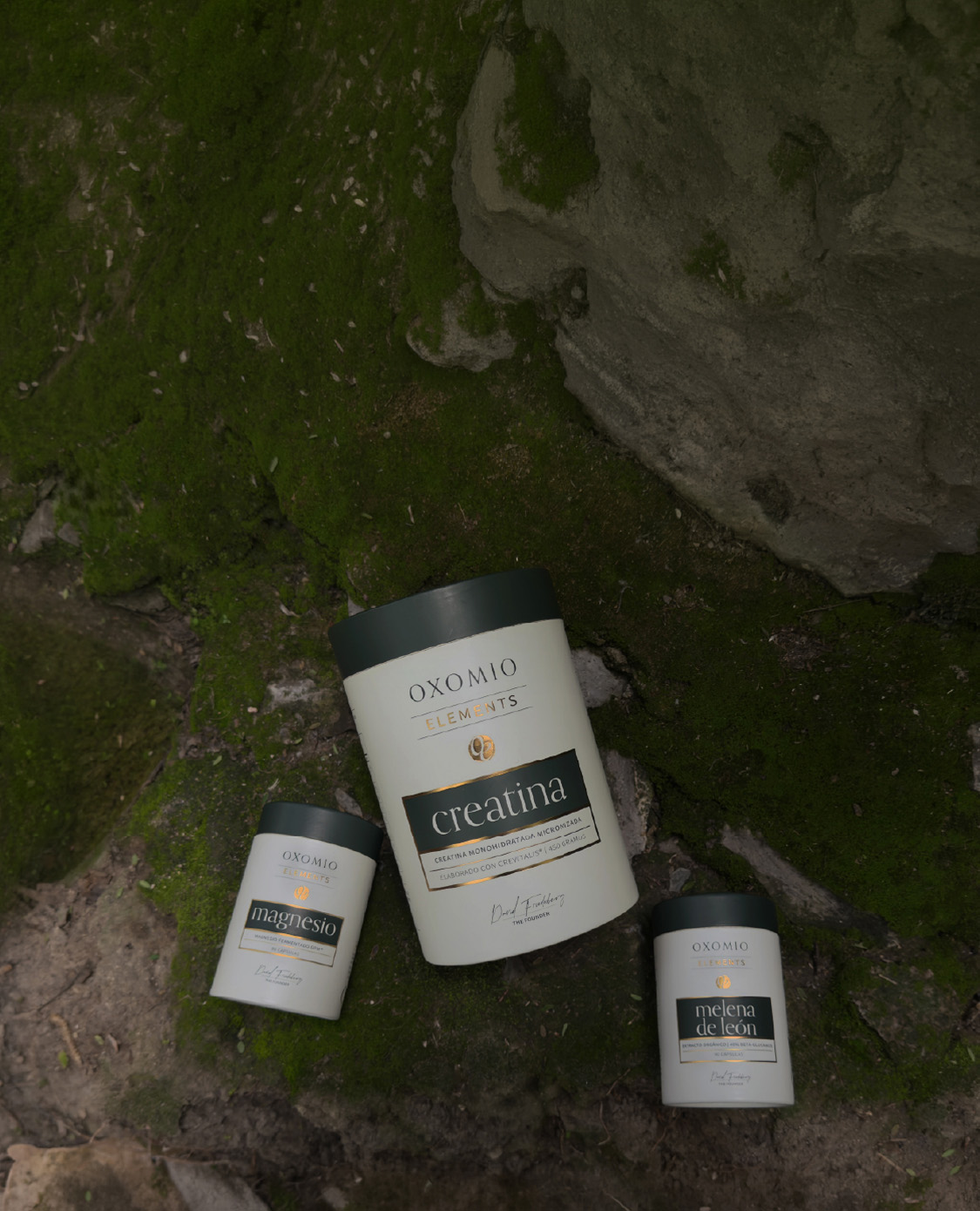
OXOMIO Elements products photographed on moss and stone
01

Packaging as a system

A family, not a sequence of one offs

The packaging system had to feel recognizably OXOMIO while giving distinct product families enough character to stand on their own. Typography, naming, color, materials, closures, hierarchy, and recurring brand devices were developed as a language that could stretch across very different products without becoming generic.

  • Repeatable product hierarchy across different supplement formats and names.
  • A controlled relationship between ivory, deep green, metallic accents, and product specific expression.
  • Packaging considered as a physical object as well as a front facing graphic.
  • Copy hierarchy and multilingual adaptation integrated into the system rather than added after design approval.

OXOMIO Eliksir packaging with product carton, certificate card, and scoop
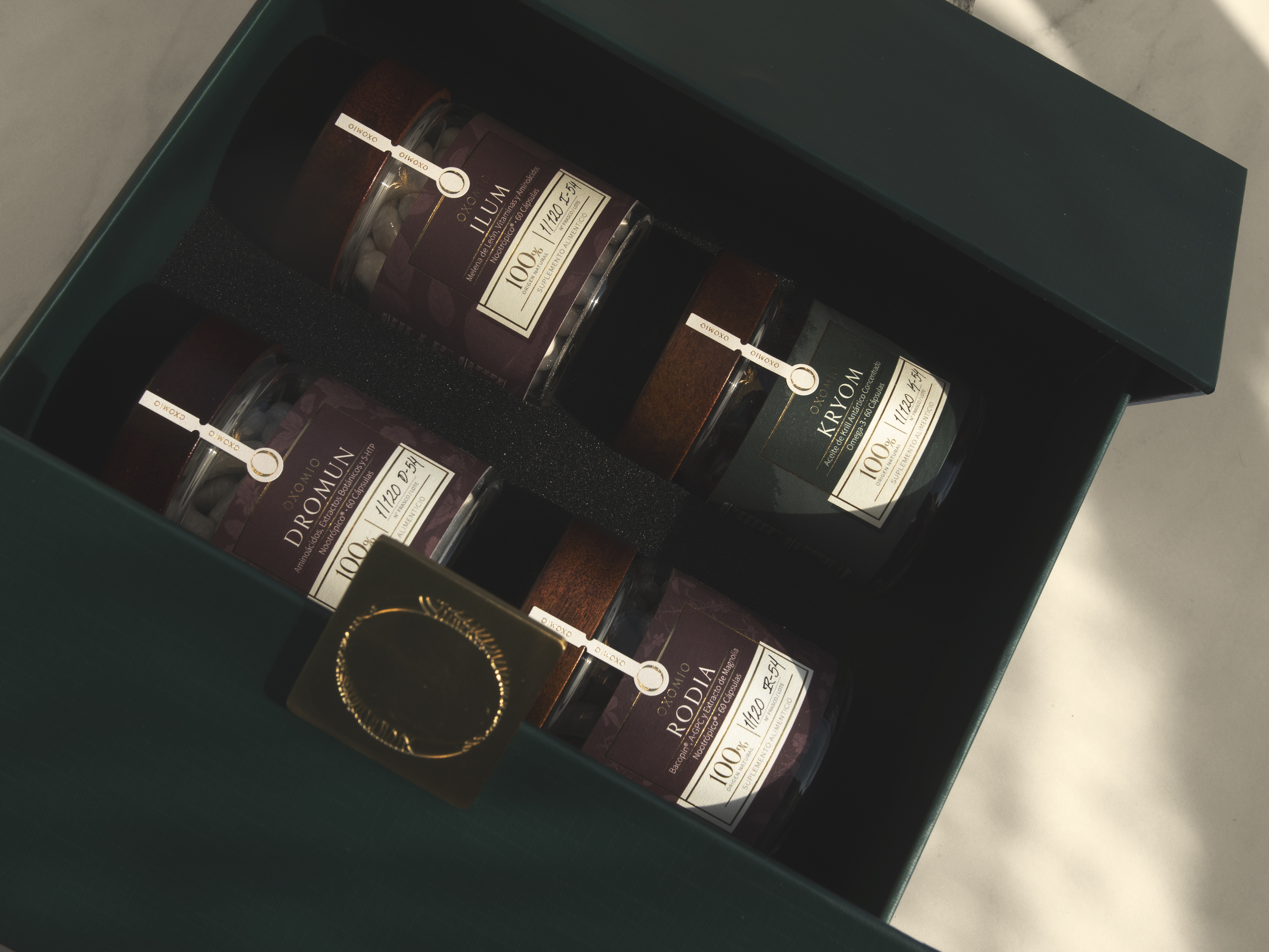
OXOMIO boxed nootropic product set in a deep green presentation box
02

Premium product presentation

The experience continues after the primary package

Higher touch products extended the identity beyond the container itself. Presentation boxes, inserts, certificates, seals, tactile materials, and supporting objects were treated as part of one composed experience, allowing the premium expression to come from the full system rather than decorative excess on a single label.

  • Primary packaging, secondary packaging, inserts, certificates, and presentation components designed together.
  • Material, color, typography, and metallic details coordinated across different physical pieces.
  • Information rich supporting materials structured to remain legible and consistent with the premium visual language.
  • Product photography and presentation designed to communicate the system as a complete object experience.
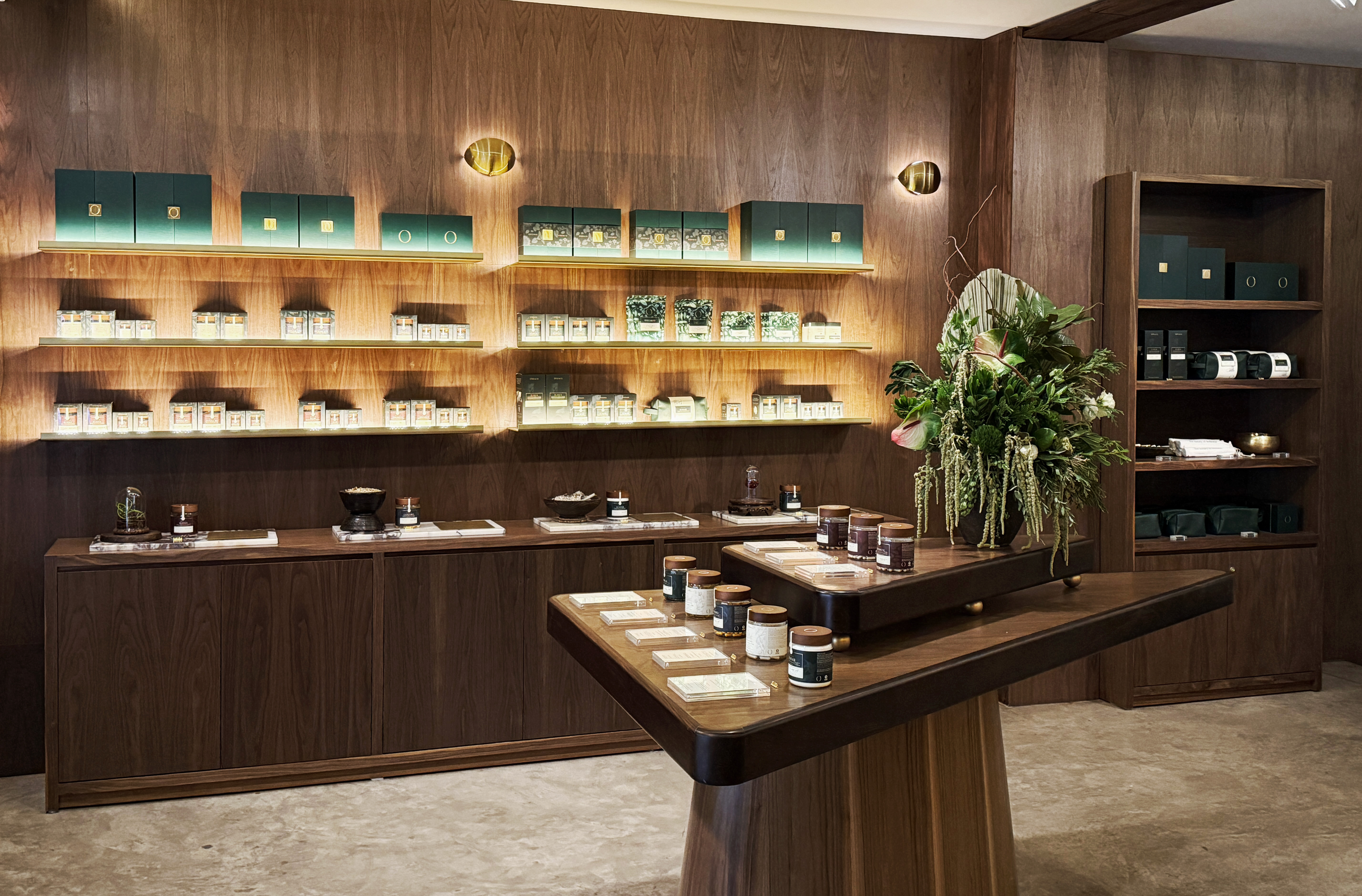
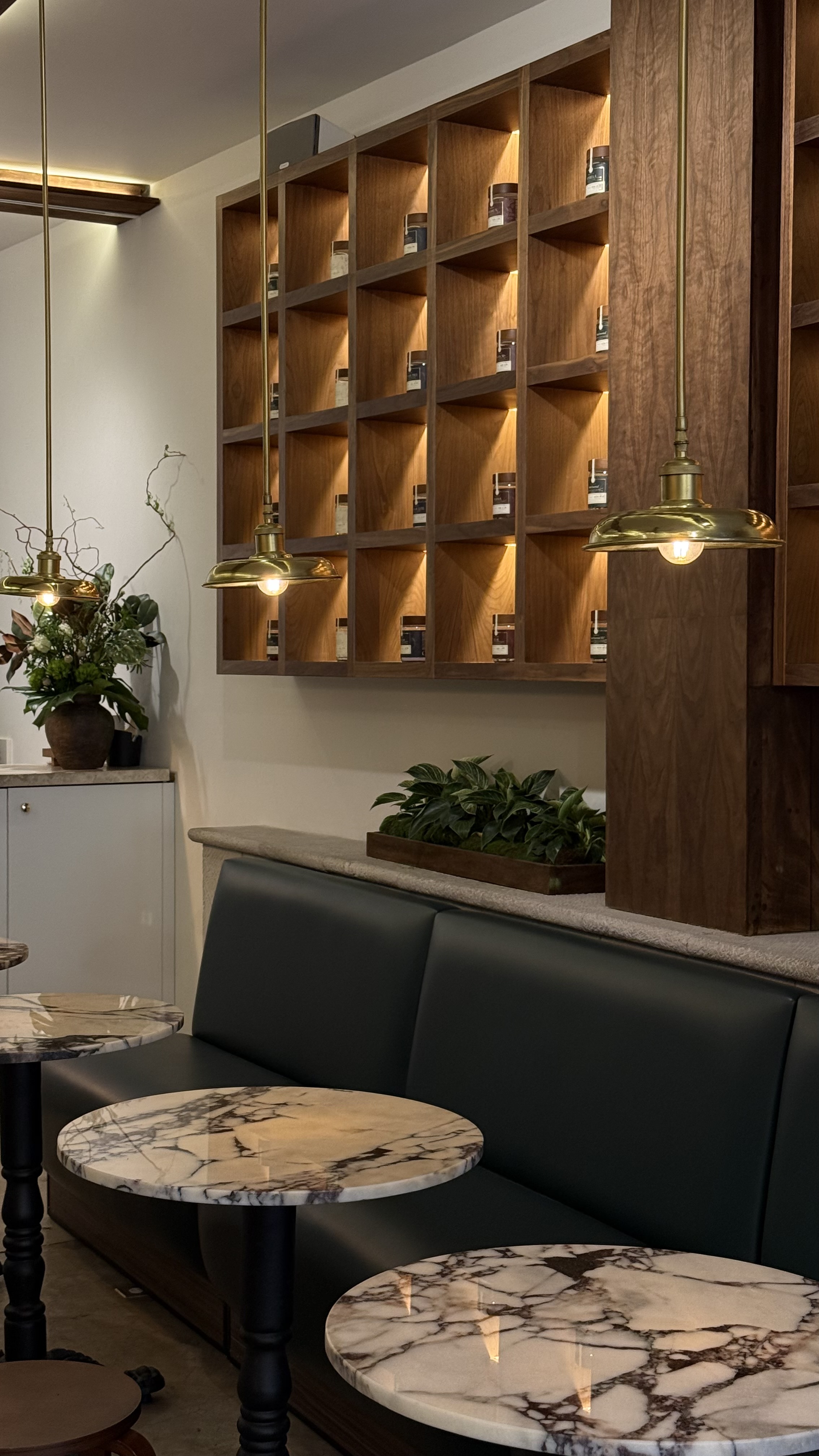
OXOMIO boutique interior with illuminated walnut shelving and product displays
OXOMIO boutique seating and walnut display wall with brass pendant lighting
03

Physical retail

From package to place

The brand also had to become an environment. Walnut, brass, stone, dark green upholstery, warm integrated lighting, planting, shelving proportions, and product merchandising translate the packaging's material vocabulary into a space customers can enter rather than a separate retail aesthetic applied afterward.

  • Retail material palette developed as an extension of the product and packaging language.
  • Illuminated shelving and display architecture designed around the scale and rhythm of the products.
  • Furniture, lighting, planting, and merchandising treated as one visual composition.
  • A consistent relationship between package, shelf presence, customer seating, and the wider boutique environment.
Additional scope

The work extended beyond the headline deliverables.

Brand stewardship

The system evolved over time rather than being frozen at launch. New products and channels were added without casually discarding recognition or accumulated brand equity.

Campaign & content production

Recurring creative could move through social, digital, launch, retail, and sales surfaces without requiring a new visual language every time.

Multilingual copy

Messaging and client facing language could be developed and adapted across English, Spanish, and French when required, allowing design and copy decisions to remain connected.

Production operations

Source files, variants, print assets, product imagery, and recurring deliverables were organized around repeat use rather than one time presentation.

Light engineering

For technically modest digital needs, design could continue into selected front end, CMS, prototype, and implementation support rather than automatically creating another vendor handoff.

What this project demonstrates

This is the kind of work Bainbridge is built around: not a single pristine concept, but a creative system that has to keep working after years of products, campaigns, vendors, edits, launches, and operational reality.
02

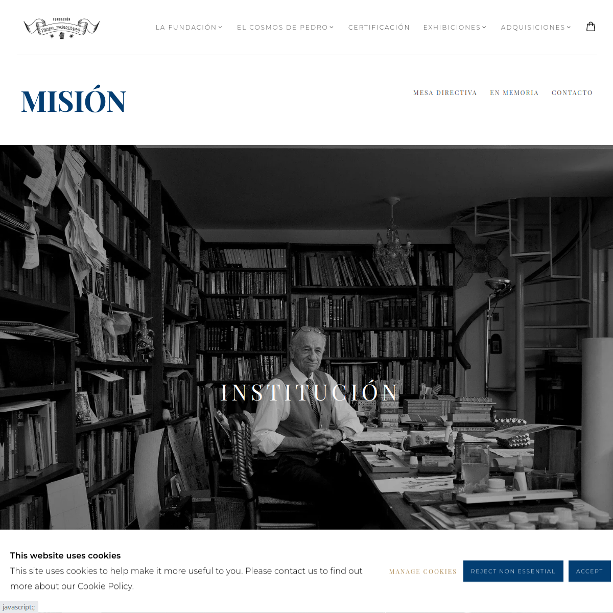
Fundación Pedro Friedeberg

Art · Culture · Collection management

Relationship
Foundation identity, digital, editorial, and operational design work by the team behind Bainbridge.
Period
2025 to present
Disciplines
Brand Systems · Digital Experiences · Editorial · Light Engineering · Collection Tools

A restrained identity and digital system for an organization built around the work of Pedro Friedeberg, designed to support the art rather than compete with it while also giving the foundation practical tools to publish, document, and manage its work.

The challenge

The visual problem was unusually sensitive: build an institutional identity around an artist whose own work is already highly distinctive and ornamental. The operational problem was broader, digital publishing, documentation, certification workflows, collection information, and recurring foundation materials all needed a coherent home.

Our response

The design approach used restraint as a feature. Typography, layout, and supporting graphic elements were built to frame the artwork rather than imitate it. Digital and operational tools then extended that same logic into publishing, archives, certification, and collection management workflows.

What the work had to do
01

An institutional visual system designed to remain secondary to the artist's work.

02

A digital home structured around artwork, exhibitions, publishing, and foundation information.

03

Editorial and documentation patterns that can extend into catalogs, records, and institutional materials.

04

Selected backend and workflow tools demonstrating Bainbridge's ability to combine design with light technical implementation.

Fundación Pedro Friedeberg, Identity around the art
01

Identity around the art

Restraint as a design decision

The foundation's identity was designed to give the artwork a consistent institutional frame without borrowing so heavily from Friedeberg's visual language that the identity became imitation. The system is quiet where the work is ornate and structured where the archive needs clarity.

  • Institutional wordmark and typographic hierarchy.
  • Layout system that accommodates artworks with very different density and color.
  • Digital first application with room for editorial and exhibition use.
  • A visual hierarchy that keeps the artist's work, not the foundation graphics, as the focal point.
Additional scope

The work extended beyond the headline deliverables.

Website & publishing

A digital archive and publishing environment for presenting works, exhibitions, biographical material, and foundation activity in a format the organization can continue maintaining.

Editorial system

Typography, grids, captions, image handling, and document structures suitable for catalogs, exhibition material, certificates, and institutional publishing.

Certification workflows

Design and selected technical implementation around records, provenance data, condition information, and certificate workflows, with the system supporting the foundation's process rather than replacing expert authentication judgment.

Collection management

Private operational tools for organizing inventory, documentation, loans, insurance information, and collector records with a clearer source of truth.

Light engineering

Straightforward digital tools and workflows could stay closer to the design team, reducing the gap between how the system was intended to work and how it was actually implemented.

What this project demonstrates

The project demonstrates the value of a design partner that can move between identity, editorial thinking, digital experience, structured information, and light implementation without turning each requirement into a separate vendor relationship.

What we think a case study should prove

Good work is more than the screenshot we choose to show.

01

The idea

Was there a clear point of view, hierarchy, or creative system behind the work?

02

The range

Could the design survive different formats, content, products, languages, and audiences without losing itself?

03

The production

Did the files, components, mechanicals, templates, or build logic hold up when someone had to make the thing real?

04

The handoff

Could the client, internal team, vendor, or developer continue using the work without reconstructing every decision?

05

The longevity

Did the system remain useful after the launch moment, when normal operational pressure began?

Selective by design

Not every good engagement belongs in a public case study grid.

White label agency work, confidential launches, unreleased materials, and private operational systems may never be appropriate to publish. We treat permission to show work separately from the standard of the work itself.

Start

Bring us work that has to function after approval.

A brand, package, campaign, website, presentation, system, or cross disciplinary project. Show us what has to work in the real world and we'll tell you where Bainbridge can add useful depth.